If the analysis was calculated properly and accepted on the user’s end, opening it from your “My Reports” list will load a results page.

TomTom O/D Analysis offers 5 different methods you can use to review the results. In this chapter we will focus on the fourth one - Spatial Sankey.
The Spatial Sankey view allows you to display the results in a Spatial Sankey. This visualization type is particularly useful if you have a lot of regions. This view makes it much easier to recognize dense flows between regions.

Selecting a specific line connecting two different regions will show you the number of trips for each direction.
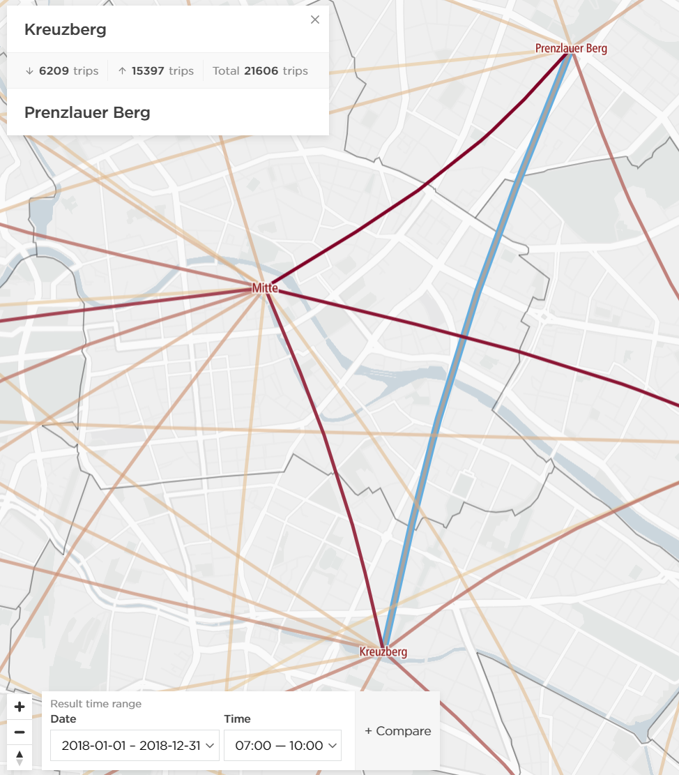
The date and the time ranges can be changed in the bottom left corner of the map.

In the case of more date ranges and time ranges in the same analysis, it is also possible to easily compare different results in the tool. The "+Compare" button allows you to load a mirrored screen showing results for a different date and/or time ranges on the same page.

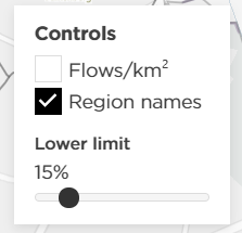
In case the analysis has many different regions and it is harder to view the results on the map, we recommend increasing the slider for the lower limit. That way the results will be clearer, and you will only see the relations with a higher trip count.